Woven by Toyota Unveils New Logo and Refreshes Brand Visual Design
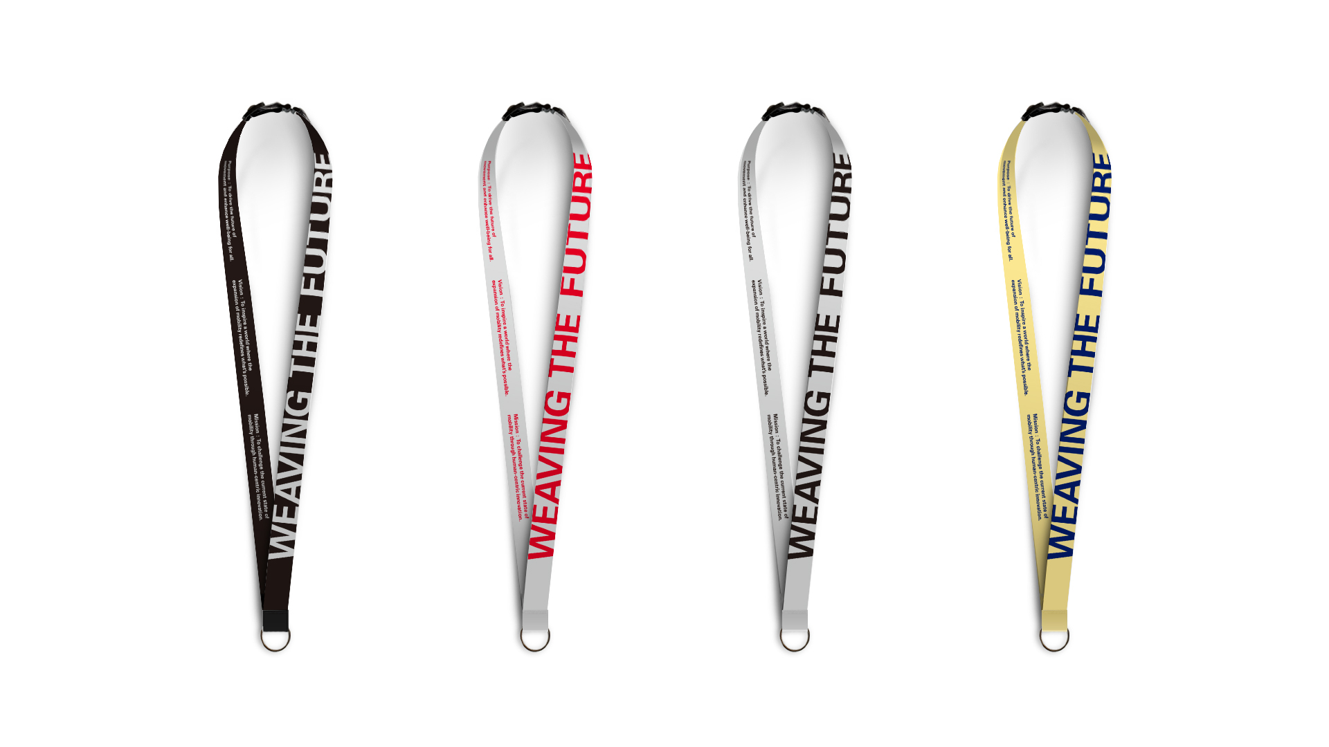
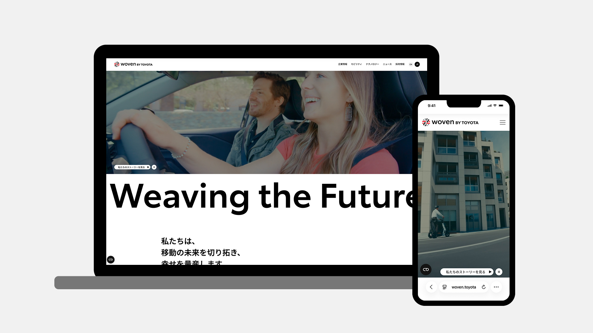
Marking the milestone of Toyota's 100th anniversary, Woven by Toyota has announced a new visual identity. In addition to the logo refresh, corporate website, corporate video, and Woven by Toyota - internal corporate goods have been renewed. The planning, design, and production were handled by Whatever.
Background
Woven by Toyota's mission is "Driver of Mobility Transformation: Continuously challenging the conventions of mobility through human-centered innovation." The new visual identity was created to bring this mission to life.
What the New Logo Represents
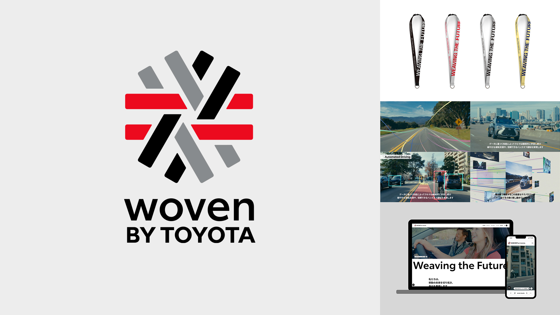
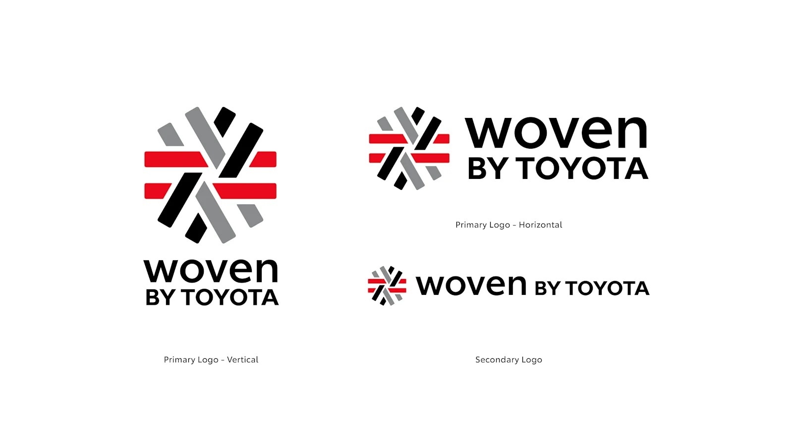
The renewed brand logo retains the hexagonal outline of the previous logo, with six lines weaving three roads that represent People, Mobility Technology, and Infrastructure. Three colors : red (symbolizing Toyota), gray (harmony of diverse voices and ideas) and black (strength toward implementation) form these intersecting roads, expressing how their combined power continues to expand.
The red road representing Toyota overlaps with the black and gray "×" that signifies Kakezan (multiplication), extending that power even further. "Kakezan" means creating a force greater than any one party could achieve alone by multiplying diverse strengths, and the way these roads are woven together symbolizes how the power we create together, and the possibilities of mobility, will spread out to the world.
A Comprehensive Brand Refresh
We conducted a comprehensive brand refresh for Woven by Toyota, encompassing logo design, website (woven.toyota) content and visual asset updates, corporate video production, and Woven by Toyota - internal corporate merchandise.
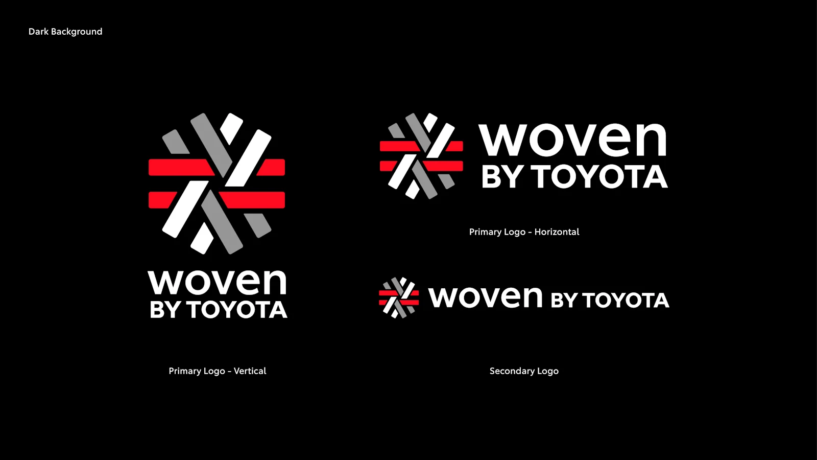
・ Logo Design
・ Woven by Toyota - Internal Corporate Goods
・ Website
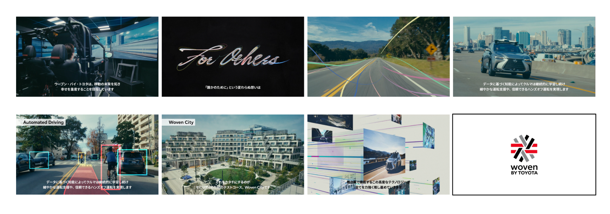
・Corporate Video
(From the website top page: https://woven.toyota/)